If you spend 8+ hours a day working in a particular space, it’s pretty important that it’s comfortable and allows you to be productive. If you spend a lot of time driving with your seat too close to the wheel, your back will start hurting. If your office is filled with crappy stationery, you’ll end up frustrated with pens containing gravity-defying ink and staplers which are only good for making holes in paper.
This sounds pretty dumb, right? Just move the seat backwards. Buy better stationery. These examples are trivial and can be fixed with almost no effort. The thing is, computer interfaces are just as important but users often settle for the default option, even when there are alternatives.
Desktops can be both functional and
elegant Credit to /u/robowarrior__ Elegant desktop](/static/d5e6b27c6ec9ee29b871ba85f65e3063/00d43/elegant.png)
Let me digress a bit, and explain what I mean by “Desktop environment”. The Wikipedia article talks about the icon, window and toolbar metaphors (although you might not want to read too closely or you’ll find this page).
To me, a good DE is defined by workflows rather than specific elements.
It should have the following.
-
The ability to launch apps with minimal friction
-
Window management that doesn’t get overwhelming as I open an increasing number of apps
-
An area to represent background apps which don’t always have their own window
-
A way to group windows into separate workspaces
-
A notification system which gets my attention without being irritating
-
Controls and feedback for volume, brightness etc.
-
The ability to tuck itself away, giving complete focus to the app I’m working on
Personally, I have tried a fair number Linux desktop environments over the years, including KDE, Cinnamon, Unity, Elementary OS’ Pantheon, Gnome 3and i3wm. I’ve even experimented with LiteStep, an alternative to explorer.exe on Windows.
As is often the case with software, all of the above had elements that I was really impressed with, but equally had failings which made me move on. I’ll mention some thoughts on three that stood out to me.
Pantheon desktop
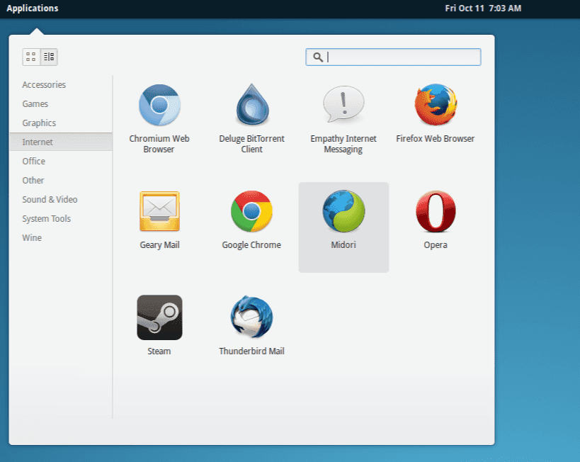
Elementary OS uses an app launcher called Slingshot.
Slingshot launcher
It’s simple, fast, and fits my use case exactly. If I want to open Chrome, all I need to do is hit SuperchrEnter. No need to involve the mouse or remember the full name of the binary. Even though most launchers (including the Windows Start Menu) work like this these days, Slingshot just works, and looks elegant in the process.
Unity
Ubuntu’s default desktop environment has a pleasantly minimal status bar. It lends itself to the style that macOS has gone with, which I think is a good thing.
Unity
Some people don’t like that it also acts as a menu bar (File, Edit, etc.), but I think that it helps with keeping everything consistent. That said, there is one corner case that I encounter quite often: If I’m looking at a particular window, but for some reason have a different one selected, it can be disorientating to get a different set of menu bar options to what I’m expecting. I don’t have a good solution to this, but it’s still irritating. Either way, this style is optional in Ubuntu 16.04 and later.
i3
An honourable mention for window management goes to i3wm. Being a tiling window manager, it’s kind of in a different league to everything else I’ve worked with, and it definitely has it’s place. Its basic philosophy guarantees an extremely efficient workflow, which I admire. Unfortunately, I found myself trying to force it to be a full desktop environment, which it was never meant to be. This included code in my i3 config like the following:
bindsym XF86MonBrightnessUp exec "xbacklight -inc 5; \
    killall notify-osd; \
    notify-send 'Backlight' `xbacklight`"
bindsym XF86MonBrightnessDown exec "xbacklight -dec 5; \
    killall notify-osd; \
    notify-send 'Backlight' `xbacklight`"
This attempts to add brightness controls via the function keys on my laptop, and give feedback via a notification pop-up. What I learned:
-
Most implementations of notify-send suck. Especially Ubuntu’s
-
i3wm is not a full desktop environment, no matter how badly you want it to be
Some days, I feel kind of bad for not using something like i3wm. My inner hacker tries to convince me that I’m a sellout, but honestly, I firmly believe that I shouldn’t have to compromise on aesthetics and conveniences like pretty volume sliders. I should be able to have both. Sorry, i3wm.
So what do I use?
At the time of this post, I’m using Unity. Not because I think it’s amazing, but because it has the least drawbacks. It has a fairly good perspective on the workflows that I care about, and has sane defaults. I only change two things on a fresh install. First, I set up a combination of the Numix theme and the Paper icon set. Then, I disable ‘scopes’ that I don’t care about like so:
dconf write /com/canonical/unity/dash/scopes \
    "['home.scope', 'applications.scope', 'files.scope']"
This reduces clutter in the app launcher and allows me to use key combinations like Super+c to open Chrome (instead of the ‘Photos’ scope).
Final thoughts
I think that what software you use isn’t particularly important, as long as it works well for you. The catch is that it’s important to know what’s out there. This means being willing to do research and leave your comfort zone to experiment. Also, not having a Linux setup doesn’t mean that you don’t have options; workflows can be improved with simple apps like a clipboard manager, or something like Alfred for macOS. You’ll find what works for you — just don’t stop trying to make your environment better.